

AEO/GEO: A New Layer of Optimization for a Changing Search World
August 3, 2025
𝐀𝐈 𝐬𝐞𝐚𝐫𝐜𝐡 𝐤𝐢𝐥𝐥𝐢𝐧𝐠 𝐒𝐄𝐎 𝐭𝐫𝐚𝐟𝐟𝐢𝐜? 𝐏𝐫𝐨𝐛𝐥𝐞𝐦-𝐬𝐨𝐥𝐯𝐢𝐧𝐠 𝐒𝐄𝐎 𝐬𝐭𝐢𝐥𝐥 𝐰𝐢𝐧𝐬!
October 15, 2025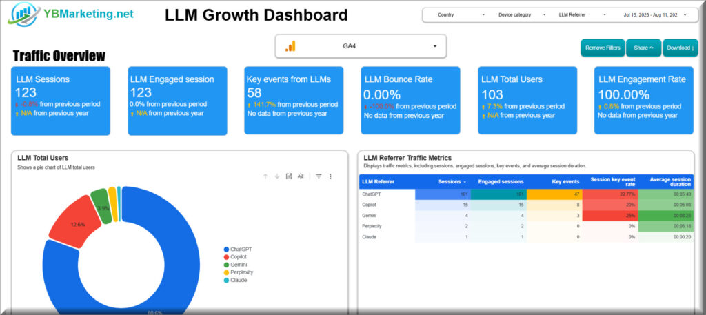
Why Existing GEO/AEO Monitoring Tools Still Fall Short, and What You Should Do Right Now
A New Era of Measurement
Generative search engines have changed the way customers search for and discover solutions. While many organizations recognize the importance of having a presence in AI systems, the question remains: how do you measure it effectively?
The tools currently on the market that aim to track brand visibility in AI still face significant challenges. In this article, I’ll explain why these tools are still minimal and propose a practical, data-driven approach you can implement today to get a real picture of your impact in AI search engines, plus a little gift from me.
The Problem: Partial Information from External Tools
Most monitoring tools today operate on a simple, limited model. They repeatedly track—sometimes thousands of times a month—a small set of queries (for example, 25 prompts) and try to use that to represent your overall presence in AI search engines like ChatGPT and Gemini.
This approach creates two core problems:
- Context-free data: Monitoring a small number of phrases gives a partial, often irrelevant picture. It doesn’t reflect the breadth of real questions potential customers ask.
- Non-actionable insights: Once you’ve optimized for those specific pages/queries, you’re out of moves. On top of that, these tools focus on finding mentions rather than providing a holistic view of brand visibility across AI search engines.
Until these monitoring systems improve and deliver genuinely valuable data, instead of chasing vanity metrics, I prefer to use an internal measurement framework that provides real value and helps me understand the current state—and how to improve it meaningfully.
The (Temporary) Solution I Built: An Internal GEO Dashboard
The most effective way to measure your GEO success right now is to use tools you already have, analyze the internal data flowing directly to your site, and act on it strategically.
To help you apply this approach immediately, I developed a dedicated dashboard that connects directly to your Google Analytics 4 account with just two clicks. It provides ground-truth data that covers all the needs mentioned in this article: it surfaces LLM session counts, mixed sessions, key events, conversions, and average session duration. The dashboard lets you analyze trends over time, slice data by landing pages, and evaluate performance by country. It also helps address GA4 attribution issues by enabling you to identify, within traffic labeled as “Direct,” the cohort that exhibits behavior typical of AI-origin traffic (long dwell times and high conversion rates), thereby revealing the actual economic value of your GEO efforts.
How to use the LLM Growth Dashboard
Getting Started
- Important – You must be connected to a Google Analytics 4 account (GA4) to import data to the dashboard.
- Choose Your Date Range and Filters: Beneath the title is a filter bar where you can select a date range, country, device category, and LLM referrer. Adjusting these filters will update all charts and tables accordingly, allowing you to explore specific periods or segments.
Traffic Overview
This section provides a snapshot of overall performance from LLM traffic.
– Summary Cards
- At the top of the page is a row of blue cards displaying key metrics:
- LLM Sessions – total sessions driven by LLM referrers.
- LLM Engaged Sessions – sessions that met GA4’s engaged criteria.
- Key Events from LLMs – number of custom “key events” triggered.
- LLM Bounce Rate – percentage of sessions with no further interaction.
- LLM Total Users – unique users from LLM sources.
- LLM Engagement Rate – proportion of sessions deemed engaged.
- Each card compares the current period with the previous period and the previous year, using icons and text to show increases or decreases.
– LLM Total Users (Pie Chart)
- This pie chart breaks down the total users by LLM referrer. It shows how much each LLM source contributes to your traffic.
- How to use: Click on a pie slice to filter the entire dashboard to that referrer.
– LLM Referrer Traffic Metrics (Table)
- The table lists Sessions, Engaged sessions, Key events, Session key event rate, and Average session duration for each referrer.
- Sorting: Click any column header (e.g., Sessions) to sort ascending or descending.
- Insights: Use this table to identify which LLM sources drive the most engagement or have longer session durations.
– Trend Charts
- Two charts show how user counts and sessions evolve over time:
- LLM Total Users Trend Overtime – a bar chart indicating how total users change month by month.
- LLM Session Trend Over Time – a bar chart showing session counts over the same periods.
- Drill‑down: Use the small up/down arrows above each chart to drill down from year to month or drill up from month to year.
- Interpretation: Look for peaks, declines or consistent growth patterns in these charts.
– Landing Pages by LLM Referrer (Table)
- This table breaks down performance by landing page and LLM referrer. For each combination, it shows:
- Sessions
- Engaged sessions
- Average session duration
- Key events
- Filtering: Use the search field above the table to focus on a specific page.
- Insights: Compare how different LLM sources interact with specific landing pages to see which content resonates best with AI‑driven visitors.
Demographic Overview
This section explores geographic and device‑level patterns.
– Sessions by Country (Geo Map)
- A world map uses bubble sizes to display sessions from each country.
- Interactivity: Hover over a bubble to see the country name and session count.
- Tip: If the map displays an error due to missing latitude/longitude values, the dashboard may need additional geo data.
– Performance KPIs by Country (Table)
- Next to the map, a table lists Sessions, Total users, Active users, and Key events by country.
- Sorting: Click on column headers (e.g., Total users) to rank countries by that metric.
- Use case: Identify countries where LLM traffic performs well or where there might be room for growth.
– Session and Key Events by Device (Bar Chart)
- This bar chart compares the number of Sessions versus Key events across device types such as desktop, mobile, and tablet.
- Insights: Identify devices that not only drive sessions but also generate key events, indicating deeper engagement.
– Trend of Session and Engaged Sessions (Line Chart)
- A line chart shows the trend of Sessions versus Engaged sessions over time.
- Drill‑down: Use the arrows above the chart to switch between yearly, monthly or daily views.
- Interpretation: Gaps between the two lines indicate differences in engagement quality across periods.

